How to make your Shopify product pages better
Thanks to the way most people search and shop now, one of your product pages will probably be their first contact with your store. In fact, they may never see your homepage at all.
That’s okay–it means people are landing on your product pages when they’re ready to buy. But will they buy from you?
It depends on how effective that product page is. Here are some ways to make yours convert.
Use SEO to Help Shoppers Find Your Products
SEO can be intimidating to new store owners because there are a lot of elements to consider, and best practices change when search engines like Google update the way they index and rank sites. It’s a good idea for any new eCommerce entrepreneur to master the basics of SEO and keep learning.
To start, these are some of the elements you’ll want to optimize on your product pages:
Page speed
There are two things to keep in mind as you check how long it takes your product pages to load. One, this page may be a visitor’s first experience with your store. Two, if it doesn’t load in 3 seconds or less on their phone, they’re probably going to leave.
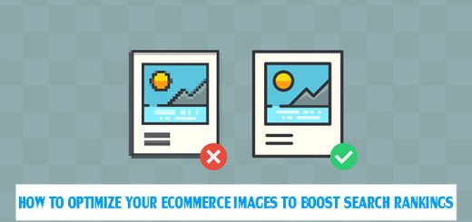
How can you get a page full of high-resolution product photos and demo videos to load fast? Start with a host that delivers fast load times. Choose a theme for your store that’s lightweight and doesn’t slow down load times. Selecting image formats, sizes, and indexing for better SEO and, yep, faster page loads.
Keywords and unique copy
You might be tempted to save time by copy-pasting manufacturer descriptions or descriptions from other pages on your site, but this can ding your search rankings. Every product page needs its own unique description that includes the keywords shoppers use to search for that type of item.
Go beyond basic keywords like “boys sandals” to so-called long-tail keywords that help people find exactly what they want to buy: “boys soccer sandals” or “toddler boys suede sandals”. This takes time, but it will help your product pages rank higher in the kinds of specific searches people do when they’re ready to make a purchase.
Behind-the-scenes SEO
Meta tags and schema markup are two elements that customers don’t see, but search engine crawlers do. The meta tags and descriptions on each page tell crawler bots what’s on the page, so make sure those robots can tell it’s a page for a “red enameled tea kettle” or “small martingale dog collar” for better click-through rates.
You can also add schema markup to your product pages to generate rich results in Google searches. The easiest way to do this is with Google’s Structured Data Markup Helper. Enter your page URLs and start tagging.

Create a Good Customer Experience with Smart Web Design and Copy
Google’s UX playbook for eCommerce is full of research-based recommendations for product page improvements. For example, each product page should include a value proposition—a free shipping deal, a coupon code, or something customers can’t get anywhere else.
Don’t be shy about putting product prices up front. Customers prefer it, and if they must hunt for the price they may move on to another store. Google recommends displaying prices above the fold (before a user has to scroll down) on product pages.
Make your descriptions easy to read
- Google suggests bulleted lists, and I agree.
- No one wants to read a paragraph full of product details on their phone.
- Customers are more likely to buy if they get the details at a glance.
Include customers’ product reviews
This is important for any kind of eCommerce site, but it’s absolutely critical if your store has many similar products. This helps shoppers decide which option is right for them without having to leave your store to find reviews.
Bonus: customer reviews can help with SEO. First, add reviews to your product pages. Then, use schema markup (see Behind-the-scenes SEO, above) to format your reviews for rich search results.

Add secondary calls to action
“Add to cart” is the most important CTA on every product page, but not every shopper is ready to buy right now. Maybe they’re on their phone and don’t want to enter credit card data on a tiny screen. Maybe they’re at work and their break is coming to an end.
Secondary CTAs like “add to wishlist”, “save for later” and “add to favorites” encourage your customers to come back later to complete their purchase.
Test, Adjust, Repeat
How will you know if your product pages are working well? Test them! Marketers use A/B testing to compare the effectiveness of two different versions of one element—an image, a headline, a call-to-action button, even the color of your page background. Once you know whether version A or version B gets better results (more click-throughs, more sales), you know which one to stick with.
To begin A/B testing elements on your pages, you can register for a free Google Optimize account. Optimize integrates with your site’s Google Analytics, and it walks you step-by-step through the process of optimizing your online store. The very first step? Create an A/B test. You’ll get a tutorial that shows you what to test, how set it up, how long your test should run, and how to manage and get reports on your tests.
Source: Hostgator’s Blog


Thank you, for sharing a very helpful article. Do you have a YouTube channel?