15 Tips To Increase Conversions On Your Landing Page
Inbound marketing is one of the most widely used strategies by digital marketing experts. To succeed in this web-based strategy, the use of a landing page is a well-known technique for converting leads. However, aside from the quality of the text and information, visuals also play a major role in converting your online visitors. That’s why we’ve compiled a list of 15 visual techniques to test on your landing page to help you optimize your conversion rates. So, let’s dive in!
- 1. Write a Catchy Headline
- 2. Write a Precise Description
- 3. Show Your Product in a Real Object
- 4. Offer an Interactive Demonstration
- 5. Tell a Story With Illustrations
- 6. Reinforce Your Text With Icons
- 7. Choose a Contrasting Color for Your CTA
- 8. Show Testimonials or Reviews
- 9. Differentiate The Menu of Your Website
- 10. Use Video and Its Benefits
- 11. Use Trust Elements
- 12. Add Directional Cues
- 13. Humanize Your Landing Page
- 14. Reference Your Landing Page
- 15. Test the landing page
1. Write a Catchy Headline
One of the most critical aspects of your landing page is the headline, which is often the first thing that a visitor sees. It is essential to craft a clear and concise title that informs the visitor about the content of your landing page. Your title should be attention-grabbing and arouse the curiosity of the visitor. Therefore, it is crucial to spend time refining your headline to ensure it accurately reflects your offer and appeals to your target audience. By creating a compelling title, you can encourage your visitors to explore your landing page further and increase your chances of converting them into leads or customers.
2. Write a Precise Description
In addition to a compelling headline, your landing page should also include a precise description that sheds light on the topic or offer presented. Your description should cover key elements that provide the visitor with a more focused idea of what they can expect from your landing page. Whether you are promoting a product, brand, or service, your description should clearly communicate the value proposition and highlight the benefits that the visitor can expect to receive. By crafting an accurate and informative description, you can help build trust with your visitors and increase the likelihood of converting them into leads or customers.
3. Show Your Product in a Real Object
According to a 2017 study by Venngage, Facebook ads with the highest conversion rates had left-aligned text and featured images of real-world objects. This finding is not only true for Facebook ads but also applies to your landing page and remains relevant today. To help your visitors visualize your product realistically, you should showcase it in a tangible object. This can help give meaning to what your visitors will receive and create a more immersive and engaging experience. By using images of real-world objects, you can increase the perceived value of your offer and help visitors connect with your product or service on a deeper level.
4. Offer an Interactive Demonstration
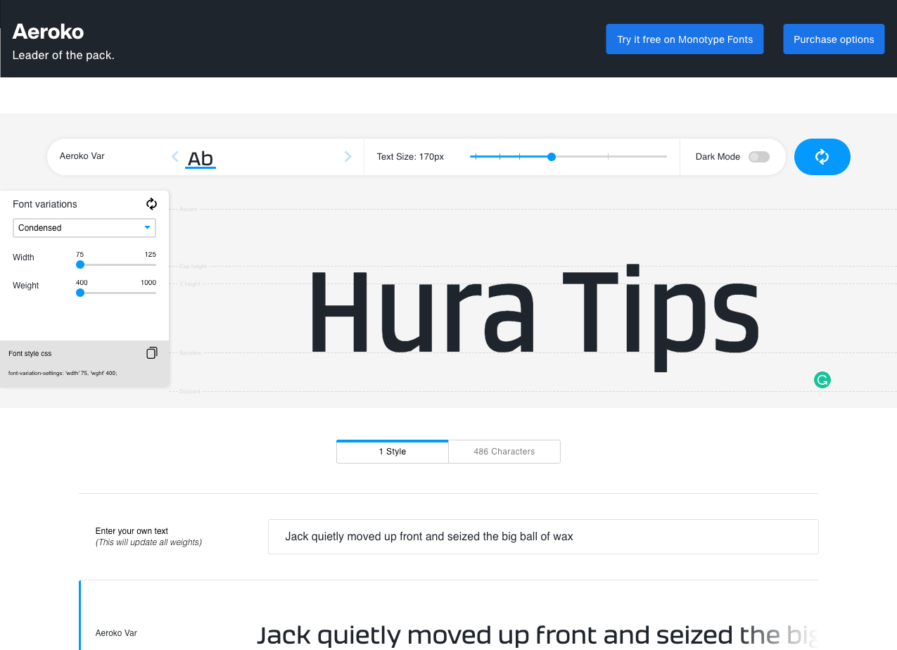
One of the most effective ways to build trust with your visitors is to allow them to interact with your landing page. After all, wouldn’t you be more likely to buy a product that you’ve had the chance to test out? One great example of this is the landing page for Monotype, where visitors can modify the typography and see a real-time preview. By enabling this type of interaction, visitors can gain a more precise idea of what they can expect from Monotype before committing further to the brand. This can help to increase their confidence in the product or service and ultimately lead to higher conversion rates. So, if possible, consider offering an interactive demonstration on your landing page to provide a more immersive and engaging experience for your visitors.
5. Tell a Story With Illustrations
Design is an essential component of any landing page, as an attractive layout can help to draw in visitors and persuade them to take action on your website. However, many brands simply rely on generic stock images to illustrate their landing pages, resulting in a lack of originality and personality. To stand out from the crowd and capture your visitor’s attention, consider using illustrations instead. This is a great opportunity to incorporate storytelling elements and drive conversions. If your industry or company culture allows it, you can even use illustrations to add a touch of humor to your landing page. By telling a story through visuals, you can create a more engaging and memorable experience for your visitors, ultimately increasing the likelihood of conversion.
6. Reinforce Your Text With Icons
Icons can be a powerful tool for conveying ideas and can be used in two main situations: to help your audience quickly understand the subject of your text without having to read it or to reinforce and complement your text. Take, for example, the landing page of WordStream, which uses a trophy icon to reinforce the idea that visitors can become more successful and beat their competitors on AdWords by downloading their whitepaper. By incorporating icons strategically into your landing page, you can add visual interest and help your visitors better understand your message.
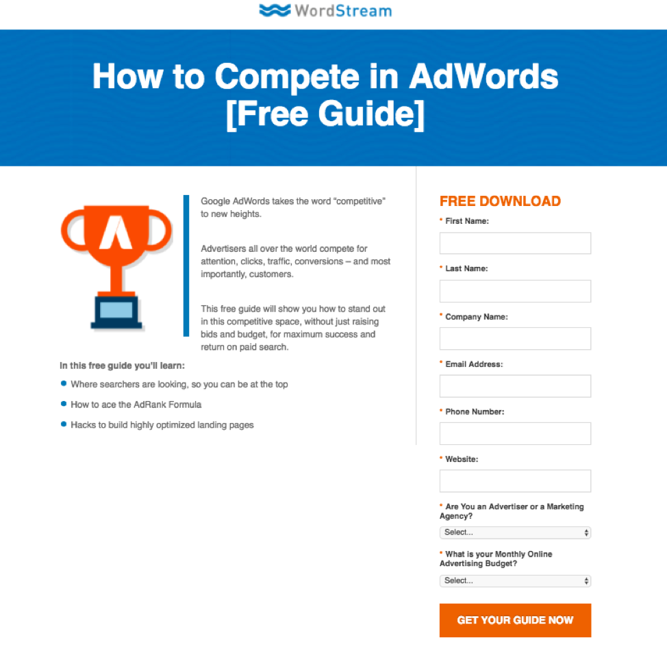
The icon also encourages visitors to read the text to learn more about the benefits that the document can provide. Using icons can be a great way to improve the visual appeal and effectiveness of your landing page.
7. Choose a Contrasting Color for Your CTA
Your visitor already has a clearer idea of your topic, which gives them the right to act or turn back. It is up to you to tip the balance in your favor to retain your visitor!
This is precisely where you should implement your Call-To-Action. It is a simple button that approves or validates the expected action (“download your ebook”, “add to cart”, “contact us”…).
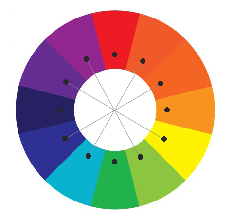
In terms of design, there is no perfect color that boosts conversions. However, for greater effectiveness, you should choose a color that contrasts with the rest of your page.
To choose the color of your CTA, use the color wheel below and choose the shade opposite the dominant color of your landing page.
8. Show Testimonials or Reviews
Showing testimonials or reviews is an effective way to build trust with potential customers. Most internet users check reviews before taking any action, and about 80% of your success depends on recommendations from other customers. Therefore, it’s essential to integrate one or more customer reviews or testimonials on your landing page to reassure your visitor and encourage them to take action.
9. Differentiate The Menu of Your Website
Many people make the mistake of displaying the menu of their website on their landing page, which can distract visitors from the main conversion goal. If you must display a menu, simplify it as much as possible. Consider displaying only the most important pages, such as “Home“, “Products/Services“, “About Us“, and “Contact“. Alternatively, consider hiding the menu altogether and including links only in the footer of your landing page. This will allow your visitors to focus on your conversion goal without being tempted to browse other pages on your website.
10. Use Video and Its Benefits
In today’s digital age, visual content is becoming increasingly important in driving conversions. Videos are a powerful tool for creating engaging content that can help boost conversion rates on your landing page. Incorporating videos into your landing page is an effective way to showcase the benefits of your product or service in a visually appealing and interactive manner. Videos are more likely to be shared, and they offer a more immersive experience than text alone. By using videos, you can also help your visitors quickly and easily understand your product or service, making them more likely to convert.
11. Use Trust Elements
Building trust with your visitors is key to converting them into customers. That’s why it’s important to include trust elements on your landing page, such as logos of your partners, clients, and suppliers. For technical products, displaying your certificates and approvals can also instill confidence in your visitors.
In addition to displaying these trust elements, it’s also important to publish informative and relevant content on your landing page. This can be achieved by providing detailed information about your product or service and by addressing any questions or concerns that your visitors may have. By doing so, you’re not only providing valuable information to your visitors, but you’re also establishing yourself as an expert in your field, which can further build trust with your audience.
12. Add Directional Cues
Adding directional cues to your landing page is crucial to improve your conversion rate. While color can help guide an internet user’s gaze, it’s not always enough. Placing directional cues through images can show your visitor where to click and improve your chances of converting them. These cues can be explicit, such as an arrow pointing to your CTA, or implicit, such as a person looking towards your CTA.
Implicit cues
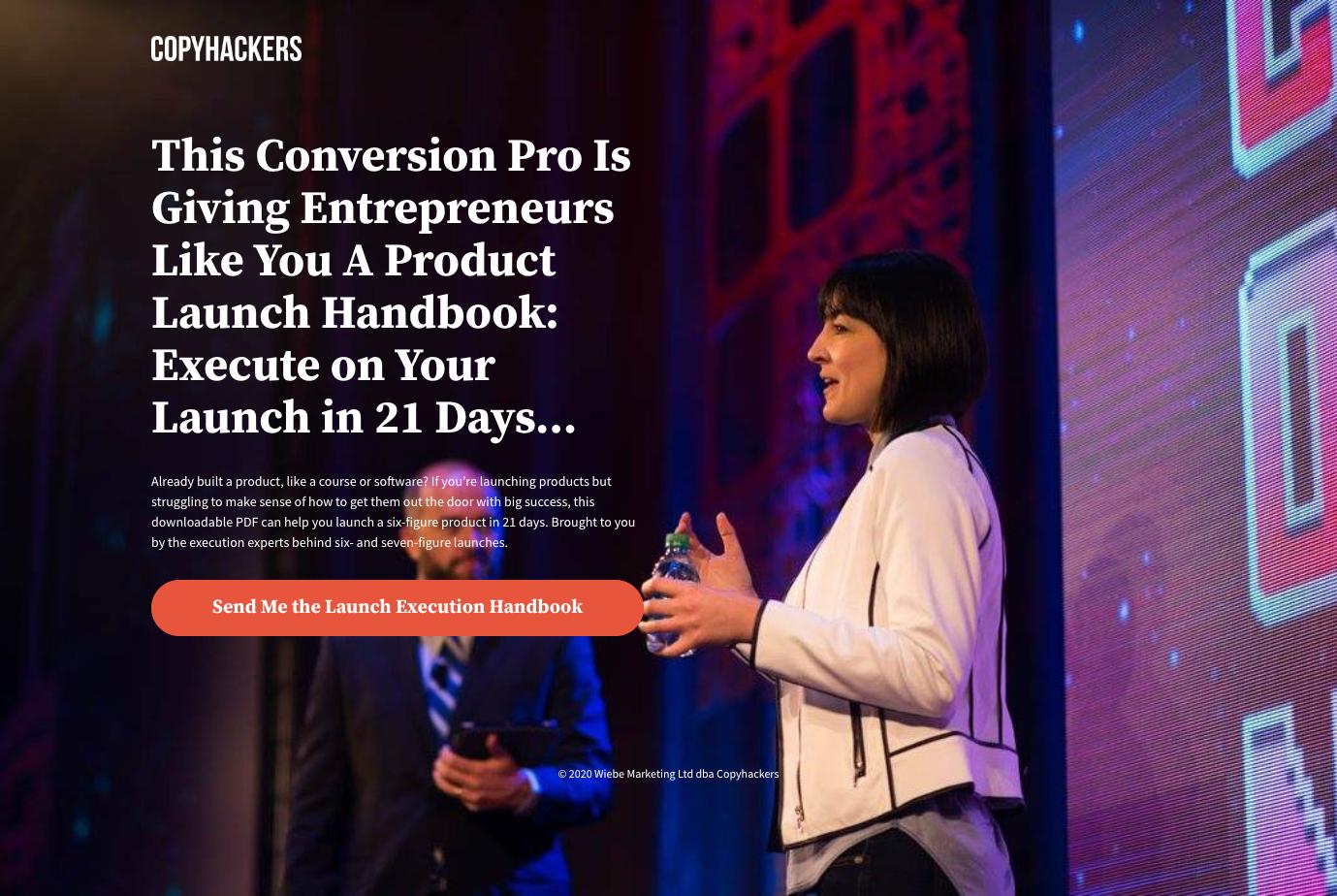
In web design, eye-tracking studies have shown that the face is the first thing people look at when encountering someone they don’t know. This also applies to website design! By including an image of a person, your visitor will surely look at their face and this is precisely where directional cues should be placed.
To better understand this concept, take a look at the Copy Hackers landing page. The woman in the image is positioned to the right of the text, her gaze is directed toward the left, and her hands are near the CTA. This simple image is very effective in implicitly guiding the visitor’s eye toward the area where they should click.
Explicit cues
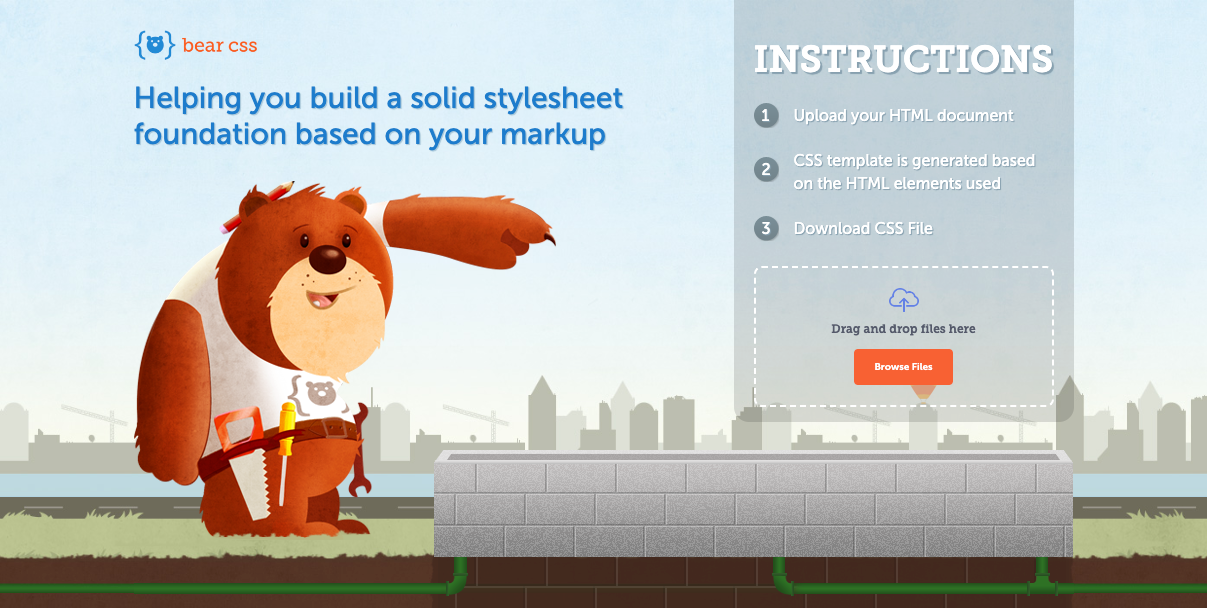
Explicit cues are much less subtle and clearly indicate to the user where to direct their attention. This can be done through the use of an arrow or an illustration, for example.
On Bear CSS’s landing page, the bear points to the call-to-action with its paw.
13. Humanize Your Landing Page
Humanizing your landing page can be a powerful way to connect with your visitors and boost your conversion rates. Including real images of people (not just models) can be particularly effective. In fact, a study by MarketingExperiment compared two landing pages, one with a smiling woman and another featuring a photo of the company’s founder. The landing page with the founder’s photo-generated 35% more conversions. By adding a personal touch to your landing page, you can make your business feel more approachable and trustworthy to your visitors.
14. Reference Your Landing Page
To naturally attract visitors to your landing page, it is essential to work on its SEO. To do so, you need to optimize several elements:
- The title tag: includes the essential keywords related to your topic to facilitate its understanding.
- The meta description: it briefly describes the subject of your landing page.
- Headlines: they structure your text with titles and subheadings.
- The code of the page: choose HTML tags that favor the systematic identification of your content by search engines.
- Optimized images for the web (size, weight, format) and suitable for your landing page.
- Backlinks to and from other pages on your site for better SEO.
15. Test the landing page
Testing is a crucial step in improving your landing page conversion rates. Even the slightest changes to elements such as text, layout, color, and font can have a significant impact on the conversion rate. It is essential to analyze each element of your landing page and identify areas for improvement. Conducting A/B tests allows you to compare different versions of your landing page to determine which elements are most effective in driving conversions. Regular testing and optimization can help you achieve optimal results and improve the overall performance of your landing page.
Conclusion
In conclusion, optimizing your landing page for conversions is crucial in the world of inbound marketing. While the quality of your text and information is important, incorporating effective visuals can significantly impact the success of your landing page in converting leads. By implementing the 15 visual techniques outlined in this article, you can improve the effectiveness of your landing page and increase your conversion rates. Remember to continuously analyze and test your landing page elements to identify the most effective strategies for your target audience. With these tips, you’ll be on your way to converting more leads and achieving your marketing goals.


