10 Tips To Customize The Shopify Checkout Page To Increase Conversions
In the realm of e-commerce, every click matters, and when it comes to boosting sales, the checkout page is the ultimate battleground. For Shopify store owners, mastering the art of customization is the key to winning customers’ hearts and closing deals. In this guide, we present ten expert tips to help you tailor your Shopify checkout page for maximum conversions. From streamlining the process to instilling trust through design, these invaluable insights will empower you to transform casual visitors into loyal buyers. Discover how small tweaks and strategic enhancements can make a monumental difference in driving your online business toward unprecedented success. Let’s dive in!
10 tips to customize the Shopify checkout page to increase conversions will be listed here:
- 1. Set up a one-page checkout
- 2. Integrate a checkout progress bar
- 3. Offer additional payment choices
- 4. Implement a minimum order value to qualify for free shipping
- 5. Create a checkout seamlessly
- 6. Allow customers to choose from various delivery options
- 7. Enhance the speed of the checkout page
- 8. Incorporate an automated discount code that is applicable only once
- 9. Create a feeling of urgency
- 10. Display related products
1. Set up a one-page checkout
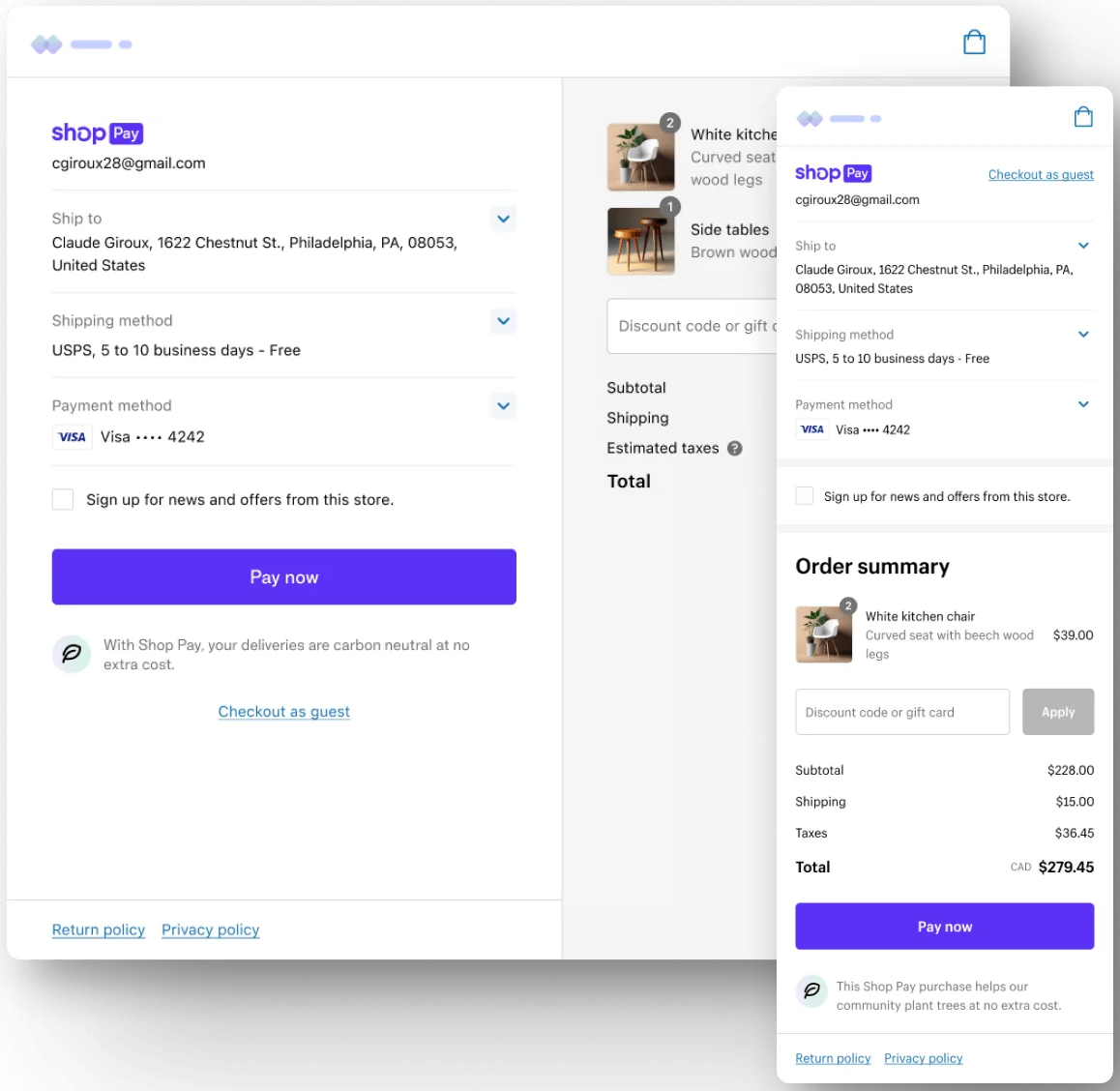
The efficiency of your checkout process can significantly impact conversion rates. Embracing a one-page Shopify checkout offers a swift and seamless buying experience, reducing the risk of shopper drop-offs inherent in multi-page checkouts. To optimize this approach, meticulous design is paramount—avoid overwhelming customers with excessive content and prioritize only essential information.
Strategically organize payment and order details on a single side, while providing a concise summary on the other. Incorporate a user-friendly text box for discount codes, avoiding any unnecessary fields or distractions. By streamlining the process and presenting pertinent information only, you create a swift and hassle-free transaction, ensuring a delightful shopping journey for your customers.
2. Integrate a checkout progress bar
While a one-page Shopify checkout may not be suitable for all businesses due to the abundance of essential information required, a strategic solution lies in implementing a progress bar. This powerful tool, placed prominently for easy visibility, offers customers a comprehensive overview of the checkout process. In a single glance, shoppers can discern the total number of steps, their current stage, and the remaining steps, effectively managing their expectations and fostering a sense of clarity.
Observe the progress bar atop the checkout page, intelligently dividing the process into three manageable steps: customer information submission, shipping preferences selection, and payment processing. By providing this intuitive visual aid, shoppers experience a seamless and organized checkout journey, reducing any perception of tediousness. Consequently, the likelihood of completed orders surges, as customers feel empowered and assured throughout the transaction process.
3. Offer additional payment choices
In the realm of e-commerce, the integration of express checkout options wields a significant influence on conversion rates. While PayPal remains a fundamental choice for online stores, discerning digital shoppers now favor a diverse array of payment providers such as Amazon Pay, Shop Pay, Google Pay, and Apple Pay.
Incorporating these alternative express payment options into your Shopify store is not merely a prudent decision; it is an imperative one. Disregarding their presence could lead to a substantial loss of potential customers, as their preferred payment method may not be available.
Embracing a comprehensive selection of payment options not only opens doors to increased sales opportunities but also communicates a profound understanding of your shoppers’ preferences and a genuine commitment to elevating the customer experience. By demonstrating this level of care and accommodation, your Shopify store exudes a sense of professionalism that resonates deeply with your discerning audience.
4. Implement a minimum order value to qualify for free shipping
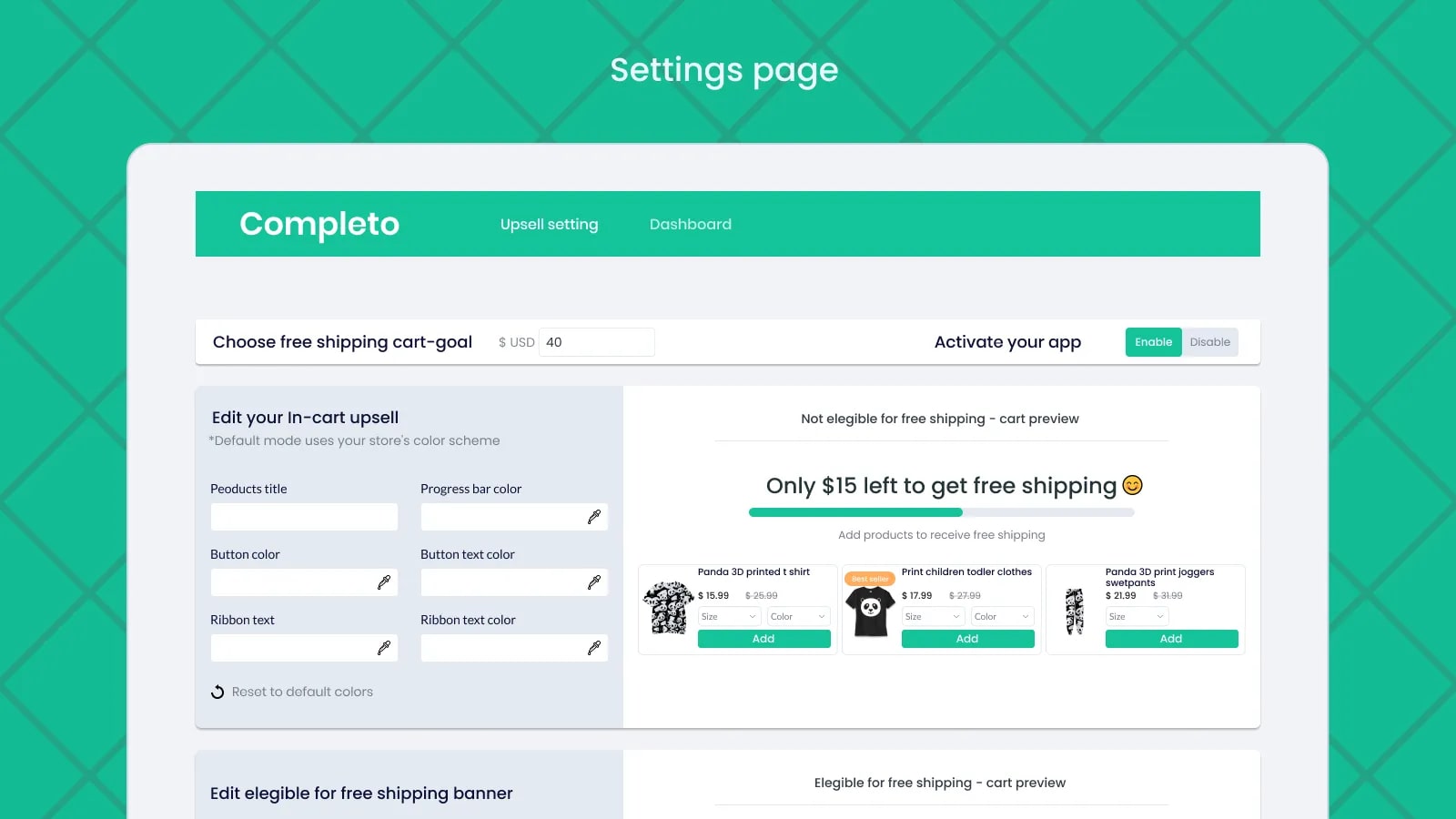
Enhancing the shopping experience through the incentive of earning free shipping upon reaching a specific threshold has proven to be a powerful strategy for boosting customer spending. To seamlessly execute this tactic, incorporating a free shipping progress bar emerges as a highly effective approach. This intelligently designed visual aid informs shoppers of the minimal amount required to unlock the cost-saving benefit, enticing them to add more items to their cart in pursuit of this enticing perk. By artfully leveraging the allure of free shipping, you not only encourage higher transaction values but also foster a sense of accomplishment and satisfaction in your customers as they approach the threshold and reap the rewards of their shopping endeavors.
Read more: 21+ Best Shopify Free Shipping Bar Apps
5. Create a checkout seamlessly
Establishing a seamless checkout experience for your Shopify store is of paramount importance for several compelling reasons. Firstly, a smooth and hassle-free checkout process enhances customer satisfaction, leaving a lasting positive impression on shoppers. This fosters customer loyalty and increases the likelihood of repeat purchases.
Secondly, a seamless checkout experience reduces cart abandonment rates. Complicated or lengthy checkout procedures can discourage customers from completing their purchases, leading to lost sales opportunities. By streamlining the process, you minimize friction and create a sense of ease and convenience for your customers.
Additionally, an optimized checkout page can positively impact your conversion rates. By eliminating unnecessary steps and minimizing distractions, you maximize the chances of converting visitors into paying customers.
In conclusion, creating a seamless checkout experience is essential for enhancing customer satisfaction, reducing cart abandonment, staying competitive, and ultimately driving higher conversion rates and revenue for your Shopify store.
6. Allow customers to choose from various delivery options
In addition to providing shoppers with the freedom to choose their preferred purchasing methods, granting them the flexibility to tailor their product deliveries to suit their individual preferences is equally crucial. Some customers may prioritize cost-effectiveness, while others may prioritize faster delivery at a premium.
Empowering customers with a delivery method picker is a strategic approach to offer enhanced control over their shopping experience. Implementing such a feature not only elevates the overall customer experience but also conveys a genuine commitment to going the extra mile to ensure their orders are delivered conveniently and to their satisfaction.
Nevertheless, due to the inherent complexity of accommodating diverse shipping rates for different shoppers, developing and integrating this feature on your own can prove to be a formidable challenge.
7. Enhance the speed of the checkout page
Optimizing the checkout page speed on your Shopify store is of utmost importance for several compelling reasons. Firstly, a fast and efficient checkout process creates a seamless and positive shopping experience for customers, reducing the risk of cart abandonment and increasing the likelihood of completed transactions.
Secondly, page speed directly impacts customer satisfaction and perception of your brand. Slow loading times can lead to frustration and a negative impression, potentially driving customers away from competitors with smoother and quicker checkout processes.
Moreover, a speedy checkout page is essential for mobile users, as they often seek convenience and rapid transactions on their devices. A slow checkout can deter mobile shoppers, hindering your ability to tap into this significant customer segment.
Additionally, optimizing checkout page speed can positively affect search engine rankings, as site speed is a crucial factor in Google’s algorithm. A faster checkout page improves SEO performance, leading to increased organic traffic and visibility for your Shopify store.
By prioritizing checkout page speed optimization, you not only enhance customer experience and satisfaction but also bolster your brand’s reputation, capitalize on mobile users, and boost search engine rankings, ultimately driving higher conversion rates and business success.
8. Incorporate an automated discount code that is applicable only once
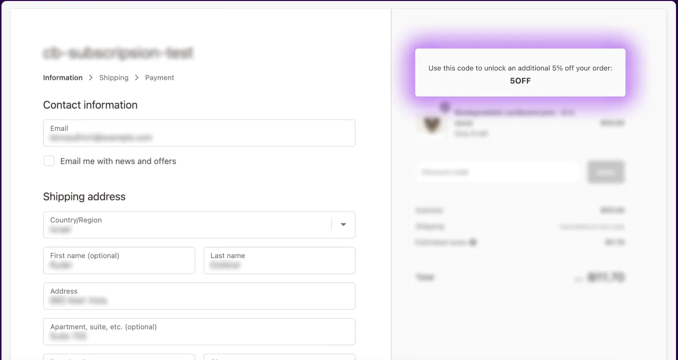
Leveraging the power of automated discounts can significantly boost sales, particularly for new Shopify stores. Utilize a captivating homepage banner to communicate your exclusive offer effectively, ensuring that the discount code is seamlessly applied and visibly presented on the checkout page.
At the Shopify checkout, the automated discount code effortlessly takes effect, affording customers the flexibility to remove it if they desire to use an alternative code. The transparency of the total discount displayed in the breakdown instills a sense of gratification in shoppers, amplifying their appreciation for the remarkable deal they are receiving. Furthermore, the time-sensitive nature of the discount incentivizes customers to complete their purchases promptly, reducing the likelihood of cart abandonment for another day.
9. Create a feeling of urgency
Instilling a sense of urgency extends beyond typical tactics such as voucher expiries and limited-time offers. Employing short-term limits can effectively deter shoppers from indecisiveness when finalizing their purchases.
To cultivate this imperative sense of urgency, consider integrating a dedicated section on the checkout page featuring a countdown timer. Inform your shoppers that they have a limited timeframe to reserve a product or seize a special offer, compelling them to act swiftly while the timer remains active. Depending on your product offerings and the intricacy of the checkout process, a countdown between 10 to 15 minutes proves optimal in motivating timely actions from customers.
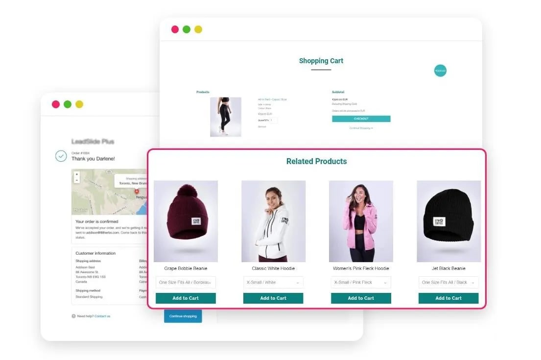
Display Related Products feature on your checkout page is a strategic move that holds immense value for your e-commerce business. Firstly, it enhances the customer experience by providing personalized product recommendations based on their current selections or past shopping behavior. By tailoring these suggestions, you demonstrate a deeper understanding of your customers’ preferences, fostering a sense of connection and loyalty.
Moreover, showcasing related products during the checkout process presents a golden opportunity for upselling and cross-selling. Customers, already committed to making a purchase, are more receptive to additional offers that complement their chosen items, leading to increased average order value and higher revenue potential.
The feature encourages impulse buying as customers encounter enticing products they might have otherwise missed. This can significantly boost spontaneous purchases and drive sales.
Display Related products feature not only streamlines the shopping journey but also contributes to a more engaging and profitable shopping experience, ultimately setting your e-commerce store apart and positioning it for sustainable growth in a competitive market.
Read more: 25+ Best Related and Recommended Products Apps for Your Shopify Store
Conclusion
In conclusion, optimizing the Shopify checkout page is a paramount strategy for maximizing conversions in the fiercely competitive world of e-commerce. By implementing the ten expert tips and techniques provided, merchants can create a seamless and personalized checkout experience that resonates with customers and compels them to complete their purchases. When thoughtfully customized, the Shopify checkout page becomes a powerful tool for driving higher conversion rates, fostering customer satisfaction, and ultimately propelling the success of any online business.


